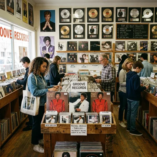
Which Album Covers Have Defined Music History?
The best album covers are the ones you can recognize in a second and still want to look at years later. A strong cover does more than decorate a record: it gives the music a mood, a face, and sometimes a whole mythology. If you are building a starter list, studying design, or just deciding which sleeves deserve wall space, the first test is simple: does the image still work when it is separated from the release date, format, and hype?
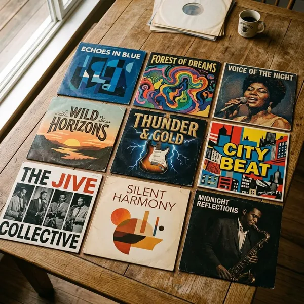
Best album covers of all time
Iconic album art usually wins on three things: instant recognition, a clear relationship to the music, and enough visual tension to stay interesting. Some covers are famous because they changed design history; others because they captured a cultural moment so perfectly that the image became bigger than the packaging.
The Dark Side of the Moon
Pink Floyd's The Dark Side of the Moon is probably the cleanest example of album-cover symbolism becoming universal. The prism, designed by Hipgnosis with George Hardie, is simple enough to remember after one glance, but it still suggests light, sound, science, mystery, and emotional range.
Its biggest lesson is restraint. No band photo, no title clutter, no decorative filler: just a black field, a white beam, and a spectrum. For anyone studying cover design, this is the sleeve to check when a concept feels overworked.
Abbey Road
Abbey Road turns a normal London street crossing into one of pop culture's most copied images. The Beatles are not posing dramatically, yet the spacing, clothing, movement, and setting make the photograph feel oddly perfect.
The cover also shows how much meaning fans can attach to a simple image. The "Paul is dead" theories helped feed the mythology, but the photograph did not need the rumors to work. It is memorable because it feels casual and staged at the same time.
Rumours
Fleetwood Mac's Rumours works because the portrait feels elegant, tense, and slightly theatrical, which suits an album full of polished songs about emotional strain. Mick Fleetwood and Stevie Nicks do not need a busy background; the pose and styling carry the mood.
Unknown Pleasures
Joy Division's Unknown Pleasures, designed by Peter Saville, uses scientific-looking pulsar waves and turns them into something cold, haunting, and human. The design has no band image and barely needs explanation, which is part of its strength.
London Calling
The Clash's London Calling captures impact in the most literal way: Paul Simonon smashing his bass on stage, photographed by Pennie Smith. The image is blurred and raw, but that imperfection is exactly why it fits the record.
The pink and green lettering, borrowed in spirit from Elvis Presley's debut cover, adds another layer. It connects punk urgency to rock-and-roll history instead of treating the album as a clean break from the past.
Nevermind
Nirvana's Nevermind is one of the clearest 1990s covers because the idea reads instantly: a baby swimming toward a dollar bill. It is strange, funny, uncomfortable, and easy to remember.
The Miseducation of Lauryn Hill
The Miseducation of Lauryn Hill uses a carved-wood portrait that feels personal without being glossy. The texture matters: it gives the image a sense of memory, education, identity, and permanence.
If you are comparing R&B and hip-hop covers from the late 1990s, this one stands apart because it avoids the most obvious glamour codes. It feels intimate, but not small.
To Pimp a Butterfly
Kendrick Lamar's To Pimp a Butterfly uses a crowded black-and-white photograph outside the White House to make the album's politics visible before the first track plays. It is not a quiet cover, and it should not be.
The practical reason it belongs among the best album covers is that it gives the viewer something to decode. A quick glance tells you the mood is confrontational; a longer look reveals power, joy, tension, performance, and unease.
Best album covers by era
Album covers make more sense when you look at the format and culture around them. A 1960s sleeve had to compete in a record shop. A 1990s CD cover had to jump out from a rack. A modern cover has to survive as a phone-sized square and still feel worth enlarging.
| Era | What changed visually | Best way to judge the covers |
|---|---|---|
| 1960s | Albums became bigger artistic statements | Look for concept, color, and cultural references |
| 1970s | Vinyl packaging encouraged ambition and detail | Check whether the idea rewards close viewing |
| 1980s | Branding, MTV, and graphic design became sharper | Notice image, fashion, type, and artist identity together |
| 1990s | Alternative culture, hip-hop, and CD design shifted the tone | Ask whether the image captured a scene or generation |
| 2000s onward | Covers had to work both physically and digitally | Test the image at thumbnail size and full size |
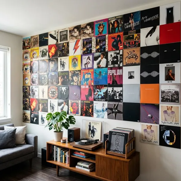
Iconic album cover design styles
Style matters, but it is not the starting point. A photographic cover can be forgettable, and a minimalist cover can feel empty if the concept is weak. The better question is whether the style gives the music a clearer identity.
Photography
Photography works when it captures more than appearance. Abbey Road gives you a place and a myth; Rumours gives you tension and glamour; To Pimp a Butterfly gives you a political scene packed with narrative.
For someone buying a print or vinyl display copy, photographic covers are often the easiest to live with because they carry human presence. The risk is blandness: a nice artist photo is not automatically an iconic sleeve.
Illustration and surrealism
Illustration and surrealism are strongest when the music needs a world rather than a portrait. Covers linked to progressive rock, metal, psychedelia, and some electronic music often use impossible landscapes or dream logic because literal photography would feel too plain.
Minimalism and symbolism
Minimal covers are easy to admire and easy to misunderstand. The Dark Side of the Moon and Unknown Pleasures work because their symbols feel precise, not because they are merely sparse.
- Good minimalism: one visual idea that becomes stronger through reduction.
- Weak minimalism: empty space used to look tasteful without saying much.
- Best use case: artists with a clear mood, concept, or visual code.
Collage and mixed media
Collage is useful when an album contains many voices, references, or cultural signals. Sgt. Pepper's remains the famous example because the cover feels like an event: part costume drama, part pop-art puzzle, part celebrity gathering.
This style rewards close viewing, which is great for vinyl and larger prints. It can struggle as a tiny thumbnail if the composition has no strong focal point.
Typography-led design
Typography-led covers treat lettering as the main image, not a label placed after the design is finished. London Calling is a strong example because the type carries energy, history, and attitude.
This approach is especially useful for designers to study. Change the spacing, weight, color, or placement, and the whole emotional temperature of the cover changes.
Famous album cover designers and artists
Knowing the names behind famous sleeves makes the history feel less random. Certain designers and artists shaped not just individual covers, but the way entire genres looked.
Storm Thorgerson and Hipgnosis
Storm Thorgerson, Aubrey Powell, and Hipgnosis helped make rock album covers more conceptual, cinematic, and strange. Their work with Pink Floyd, Led Zeppelin, Genesis, and others often used staged photography and surreal ideas rather than ordinary band portraits.
Their covers are worth studying when you want to see how far a sleeve can go without losing contact with the music. The Dark Side of the Moon is the famous clean symbol, but much of their catalog is more dreamlike and unsettling.
Peter Blake and Jann Haworth
Peter Blake and Jann Haworth's work on Sgt. Pepper's Lonely Hearts Club Band helped prove that a cover could be dense, theatrical, funny, and historically important at the same time.
The key lesson is not "add more detail." It is that every detail should help create the album's world. Without that control, collage turns into clutter.
Andy Warhol
Andy Warhol brought pop art's boldness and fine-art status into record packaging. His banana cover for The Velvet Underground & Nico remains one of the clearest examples of an album image becoming a collectible object in its own right.
Warhol's strength was understanding how a simple image could become branding, provocation, and art at the same time.
Peter Saville
Peter Saville changed the look of post-punk and electronic-adjacent music through restraint, spacing, art references, and coded systems. His work for Joy Division and New Order often avoids obvious music imagery, which makes it feel more mysterious.
- Study him for: minimal structure, cultural references, and quiet authority.
- Best-known lesson: a cover can feel powerful without showing the artist.
- Design risk: copying the surface style without the underlying idea can feel sterile.
Anton Corbijn
Anton Corbijn's photography shaped the visual identity of artists such as U2, Depeche Mode, and Joy Division-related projects. His images often feel stark, serious, and emotionally distant in a way that suits music with tension or grandeur.
Conclusion
The covers that last are rarely just attractive squares. They give the album a visual shortcut: a prism, a crossing, a wave pattern, a staged portrait, a smashed bass, a political scene. If you are making your own shortlist, choose the sleeves that still communicate at a glance and still reward a longer look; that combination is where most of the best album covers earn their reputation.
FAQS
What is the most famous album cover?
The Dark Side of the Moon and Abbey Road are the safest answers. The first is probably the strongest graphic symbol; the second may be the most widely recreated pop photograph.
Why is The Dark Side of the Moon cover so iconic?
It reduces a complex album to one perfect visual idea. The prism is simple enough for instant recognition, but the light spectrum still feels connected to sound, mood, and transformation.
Why is the Abbey Road album cover famous?
It made an ordinary street scene feel mythic. The clean composition, the band's timing, and decades of fan recreations turned the crossing into a landmark image.