How Do Anime Visual Novel Backgrounds Shape Each Scene?
If you are choosing anime visual novel backgrounds, judge them less like standalone illustrations and more like working game screens. The best background fits your sprites, leaves the dialogue area readable, supports the scene's mood, and has clear usage rights before you build your story around it.
What are anime visual novel backgrounds?
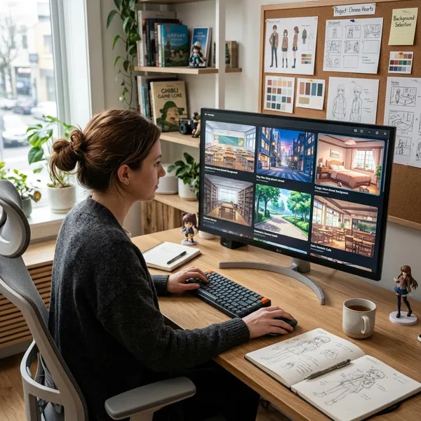
Anime visual novel backgrounds are the scene images that sit behind character sprites, text boxes, menus, and effects. They show where the conversation is happening and quietly tell the player what kind of moment they are entering.
They are different from event CGs. A CG is usually a special illustration for a major confession, reveal, fight, or emotional turning point. A background is used more often: a classroom for daily scenes, a bedroom for private moments, a street for transitions, or a café for recurring conversations.
Reusable scene art behind character sprites
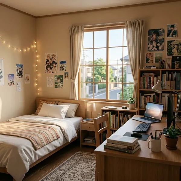
A background needs to work more than once. A protagonist's room might appear in a casual morning scene, a late-night worry scene, and a route ending, so it should not be composed around one very specific pose or one narrow emotional beat.
Location and mood cues for each scene
Backgrounds also save the script from over-explaining. A bright school hallway tells the player "normal day" before anyone speaks; the same hallway at night can feel lonely, tense, or suspicious.
- Warm light: useful for comfort, romance, nostalgia, or safety.
- Cold light: better for distance, mystery, hospitals, offices, or unease.
- Rain or dusk: good when the scene needs emotional weight without adding more dialogue.
- Cluttered rooms: helpful for personality, but risky if sprites and UI get lost.
What makes a good visual novel background?
A good visual novel background is attractive, but it is also practical. Players will read over it for long stretches, so clarity often matters more than tiny detail.
Before approving any asset, place it inside an actual game mockup with at least one sprite and your dialogue box. Many weak choices only become obvious when the full screen is assembled.
Clear space for character sprites
Look for natural standing zones in the center and side thirds of the image. If every useful spot is blocked by chairs, railings, lamps, doorframes, or important props, your sprites may look pasted on rather than placed in the scene.
This matters even more if you use large half-body or full-body sprites. A background that works for one centered character may fail when two characters need to face each other during a long argument.
Simple areas behind dialogue boxes
The lower part of the image should be calm enough for text. It does not need to be blank, but it should not be packed with sharp patterns, bright highlights, or tiny objects directly behind the dialogue window.
Consistent perspective and scale
Perspective problems make sprites feel wrong even when the art looks good by itself. Check whether camera height, floor angle, door size, and furniture scale feel compatible across your background set.
- Compare horizon lines across rooms and streets before mixing assets.
- Use the same sprite size in every test mockup.
- Watch for extreme angles unless the scene intentionally needs drama.
Lighting that fits the scene
Lighting should match the purpose of the scene, not just make the image look dramatic. A soft afternoon classroom works for everyday friendship scenes; heavy shadows in the same room may be better for a secret meeting or psychological turn.
Also compare the background's brightness with your sprites. If your characters are clean and brightly lit while the room is dark and heavily painted, the mismatch can make the screen feel assembled from unrelated assets.
Art that matches the sprites
The background does not have to be identical to the sprite style, but it should feel compatible. Pay attention to saturation, line softness, texture detail, shadow style, and how realistic the objects look.
How to plan your background count
Start from the script, not from a shopping cart. Background count depends on story length, route structure, repeated locations, and how many scenes genuinely need a visual change.
A small visual novel may work with a tight set of core locations. A route-heavy game usually needs more, but "more" should still mean useful: repeated locations, key emotional scenes, and variants that the player can actually notice.
List every story location
Write down every place shown on screen, even if it appears briefly. Use specific names such as "protagonist bedroom," "school rooftop," "café counter," or "station platform" instead of broad labels like "school" or "city."
Group repeated locations
Group locations into families so you can see the shape of the project. School might include classroom, hallway, gate, rooftop, and clubroom; home might include bedroom, kitchen, exterior, and living room.
This helps with style consistency. Buying five random school assets from different packs can look cheaper than using three well-matched ones that clearly belong to the same world.
Prioritize frequently used scenes
Your most-used scenes deserve the best fit because players will stare at them the longest. If the main bedroom, classroom, office, or café has poor sprite space or mismatched lighting, the problem repeats every time the story returns there.
- Spend more care on shared route locations than one-time transition spots.
- Commission or customize signature rooms if they define the game's identity.
- Use simpler assets for brief scenes that do not carry major emotional weight.
Add only useful scene variants
Variants are worth adding when they change what the player understands: day to night, sunny to rainy, normal room to damaged room, ordinary schoolyard to festival setup.
If the difference is only a tiny prop change that most players will miss, it may not justify extra cost, file management, and testing. For a temporary prototype, one clean base version may be enough; for a polished release, variants should earn their place by changing mood, time, or story meaning.
Ways to create visual novel backgrounds
There is no single correct way to make backgrounds. The right method depends on budget, timeline, art direction, and how much control your story needs.
Commission custom artwork
Custom art is the strongest choice when a location carries identity or story weight. A detective office, magical library, idol rehearsal room, royal chamber, or protagonist bedroom can say a lot about the game before the first line of dialogue.
The trade-off is cost and planning. Give the artist sprite sizes, UI placement, aspect ratio, mood references, and the role of the scene. Also confirm whether you are buying exclusive rights, commercial usage, editing rights, or only limited permission.
Buy licensed asset packs
Asset packs are useful for prototypes, short projects, and common settings such as schools, homes, streets, offices, and cafés. They let you test pacing and layout quickly before committing to a larger art budget.
Do not buy only because the preview image looks nice. Check whether the pack has a consistent style, enough resolution for your game, permission for commercial use, and rules about editing or attribution.
Paint from photo references
Photo references can help with structure, perspective, and believable object placement, especially for grounded locations like apartments, stations, shops, and city streets.
The important step is transformation. Simplify textures, adjust colors, redesign clutter, and make room for sprites and the dialogue box. A background that still feels like a filtered photo can clash badly with anime character art.
Build scenes with 3D tools
3D tools are helpful when you need stable perspective, multiple angles, or repeated versions of the same space. A classroom or apartment can be built once, then rendered with different lighting or camera positions.
The risk is stiffness. Many 3D renders need paint-over, softer lighting, texture cleanup, or color adjustment before they sit comfortably behind anime sprites.
Use AI-assisted workflows with review
AI-assisted images can be useful for mood exploration, rough composition, or early concept options, but they need careful human review before they become production assets.
Check for broken architecture, inconsistent perspective, unreadable details, style drift between images, and unclear commercial permissions. For a public or paid game, keep records of tools, licenses, edits, and final asset sources instead of assuming every generated image is safe to use.
How to choose backgrounds for your visual novel
Choose backgrounds in this order: story function first, sprite and UI fit second, technical fit third, and licensing before final approval. A beautiful image that fails one of those checks can become expensive later.
Match the genre and mood
A school romance usually benefits from welcoming classrooms, soft outdoor scenes, bedrooms, streets, and date locations. A horror or thriller project may need emptier rooms, harsher lighting, colder colors, or backgrounds that make familiar places feel unsafe.
Prioritize key locations
Pick the locations that carry the story before spending time on decoration. These are usually places where main characters meet often, secrets are revealed, routes split, or endings land.
- Mark scenes with major plot or emotional turns.
- Count how often each location appears.
- Separate essential, useful, and optional backgrounds.
- Mock up the essential scenes with final or near-final sprites.
Check sprite and UI fit
Place your sprites over the background before approving it. Test one character, two characters, and your most crowded common layout. Then turn on the dialogue box and check whether the lower area still reads cleanly.
If you are choosing between two similar assets, pick the one that gives you easier staging. A slightly simpler room often works better than a detailed one that fights every sprite position.
Confirm technical requirements
Match the image to your target aspect ratio and display size, and use larger source files if you plan to crop, zoom, pan, or create parallax. If the asset is already barely large enough, small camera moves can expose blur or rough edges.
Verify commercial-use rights
Do this before the asset enters your build. Confirm whether commercial release is allowed, whether edits are permitted, whether attribution is required, and whether there are platform or resale limits.
Conclusion
The safest choice is rarely the flashiest background; it is the one that supports the scene, fits the sprites, stays readable under the UI, and can legally ship with your game. Plan the core locations first, test them in real layouts, and only add variants or extra scenes when they change the player's understanding of the story.
FAQS
Can I mix custom and stock visual novel backgrounds?
Yes, and it is often practical. Use custom art for locations that define the game's identity, then choose stock assets that match the same perspective, color range, and detail level.
Can visual novel backgrounds use animation or parallax?
Yes, as long as the movement does not fight the reading experience. Subtle rain, drifting clouds, light flicker, or separated foreground depth can work well; constant busy motion usually becomes tiring.
Can the same background be reused across different routes?
Yes. Reuse is normal in visual novels, especially for shared locations. Change lighting, music, sprite placement, or context when the route needs the place to feel different without requiring a new image.